
Having decided on a name I needed to decide upon a 'look' for the magazine. I had assumed, as most of my influence is from vintage children's illustration, books and magazines, that my own would be of a similar look. However choosing fonts has had an interesting influence on my decision.
I found this dust jacket from a book all about cooking with Spam, which, funnily enough, was being thrown out. I HATE Spam, but I love the graphics, the colours and fonts they use - and lo and behold, who'd have thunk it, Spam became a bit of a guiding light...

It reminded me hugely of a very 80's, graphic style that, probably through osmosis, I really love. Strong primary colours, rainbows, huge curved lettering - I decided to see what I could find on the Internet that might satisfy my nostalgia or further spur me on...


...and that's when it dawned on me: everything I loved in the 80's came from America (including Cricket Magazine!). I'm not at ALL sure what effect this knowledge is going to have, but I DO know that I want my Magazine to be inclusive and certainly not leaning towards a specific country in an era that has been and gone! So I am reassuring myself that I will only borrow aspects of the bits I like...
Free Fonts:
I went online to have a look at what fonts were out there and found a cornucopia of free fonts - having had no real need for extra-curricular fonts before, I had no idea that they were out there - I've been missing out! Here are just some of my favourites that I'd like to use for the Magazine:


As you can probably tell from this Blog's header, I've pretty much made my decision. I love the geometric, angular, in-your-face qualities of this font:

I like how the OLO looks like a nose and glasses - that's something I need to look at for a logo or continuous little cartoon character that pops up throughout the Magazine.


I also love how the A's look like Mountains. It still has that 80's vibe about it but more in a way that some of the best bits of 80's graphics and design have come back into the current mainstream. I really think it works and I'm pretty excited about it!
.........................................................................
PUZZLEMENTS:
It's far too early for me to be looking at actual finished content for the Magazine - but having looked at length at fonts and how words and lettering work together it reminded me how much I used to love word puzzles, particularly wordsearches. I adored words (and still do) and searching for them in a soup of letters was always a treat - I decided to have a go at making my own for the Magazine and as a starting point I'm pretty pleased with it:

.........................................................................
FURTHER FONT FINDINGS:
I wanted to muck around with the fonts and make it feel a bit more modern - but the danger in doing that is to make the puzzle more visually confusing. So I asked a dyslexic friend to road-test it for me and the results were pretty positive - next test is to get some kids to have a go!

The garish colouring of the spam logo that had so inspired me, as mentioned in an earlier post, was reminding me of something else, I just couldn't put my finger on it. Then whilst doing something mundane, my brain slotted into place and reminded me of Edward Ruscha and his 'OOF' which he painted in 1962. Once that kicked in I suddenly remembered all the Pop Artists of that era whose work I've always really loved. I thought I'd have a look and see which ones may be particularly relevant and this is what I came up with:
 |
Another by the brilliant Edward Ruscha, also painted in 1962
|
 |
Edward Ruscha, 1964
|
Of course it wasn't only Ruscha who used font as subject matter, I also love these paintings by Robert Indiana:
 |
1968
|
 |
1969
|
 |
 |
1966
|
And finally, the genius that is Sir Peter Blake:


.........................................................................
TO ZINE OR NOT TO ZINE:
Size matters - I've been running it over and over in my head about size and shape and paper type and inks and printing costs and binding costs etc., etc. I would love to make this the most beautiful Magazine that ever was, but I need to face facts that ability and budget are constricting. Ability I can work on, not so much the budget... Having always had an A5 size in mind it suddenly occurred to me that if I was clever about it, there's no reason why I couldn't print them myself - it can still be A5 but just more like a hand-made Magazine - a Zine in fact.
So then I started thinking about a Zine for children, why not? If anything it makes it more current, more accessible, more affordable for both the maker and the buyer and a Zine can always grow up into being a Magazine if that's the way it was destined to go. Another exciting development.
So I've started doing some research and I think there are a few Zines for kids out there - but it definitely needs to be explored some more. In the meantime I'm going to be forging ahead with the Zine dream in mind. Now the only problem I have is the title - Piccolo Zine doesn't look nearly as good as Piccolo Magazine... time for a rethink on the font?
.........................................................................
LITTLE MONSTERS:

I want to have sections in the Zine that each correspond to the colours of the rainbow and each colour stands for 'activities' or 'stories', 'poetry' or 'things to make' etc. One of the 'things to make' I want to include is Sock Monsters. I've always intended to have a go at this myself and just never got round to it - I needed to make sure that it wouldn't be too difficult for a child/early teen to make so I had a go myself (see above). I'm pretty pleased with the results and am going to be making some more, but this time taking pictures at each stage. I'll either include the photos or make drawings from the photographs, I haven't decided which yet! I also want to get some kids to have a go using my instructions, I'll then include pictures of them holding their masterpieces...
.........................................................................
One constant source of material and inspiration are other people's amazing Blogs - here are some I've found, written by some very industrious Mums, in which they've been sharing with the world their brilliant ideas on how to get their kids into crafts - I've been having a great rummage around for ideas, they're really brilliant, I just can't imagine how they get the time to write them!
Here is a list of some of my current favourites:


Modern Parents Messy Kids: http://www.modernparentsmessykids.com


Estefi Machado: http://www.estefimachado.com.br/ (this one's all in Brazilian but nothing a bit of Google Translate can't help with and also the photo's on her blog as a guide are great!

Handmade Charlotte: http://www.handmadecharlotte.com/simple-wonderful-diy-crafts-kids/
.........................................................................

.........................................................................
One of the things I want to do is put my own written content in the magazine - or at least partially. I'm taking huge inspiration from a book I read over and over again as a child which was called: 'Hurry, Hurry Mary Dear and other Nonsense Poems' by N. M. Bodecker - he illustrated as well as wrote the poems and it had me enthralled. Here's a small selection to show just how charming both his words and his drawings are:


I love the character and the simplicity of his sketches but they're also very much 'of a time' these are some examples that I particularly love and want to have a crack at, as a style, myself:
 |
| N.M. Bodecker |
 |
| N.M. Bodecker |
 |
| N.M. Bodecker |
 |
| N.M. Bodecker |
This style of drawing with a degree of naivety and seeming to be almost slap-dash with the pen (but actually being exceptionally sharp and usually an excellent draughtsman) was, as I said before, very much of a time - starting in the late sixties and being forced out of children's books by the mid 80's. Another real favourite of mine is the Illustrator Friso Henstra. The Illustrator's who drew in this whimsical, simplistic way seemed to be drawn to the most fantastical of stories which only ever made the children love them more - particularly this one - here are some examples of Friso Henstra - a style I'd also like to have a go at...
 |
| Friso Henstra |
 |
| Friso Henstra |
 |
| Friso Henstra |
 |
| Friso Henstra |
 |
| Friso Henstra |
 |
| Friso Henstra |
 |
| Friso Henstra |
 |
| Friso Henstra |
 |
| Friso Henstra |


.........................................................................
Inspiration in Zine form comes courtesy of the brilliant creator of The Green Bean, Katie Green. I love the simplicity of her drawing style and that EVERYTHING in each issue is drawn, even the most mundane things, which makes them instantly interesting and not mundane at all:
I particularly like the way she does her recipes and thought I'd have a go at producing something similar which led me to this:


Next I had to choose whether or not to use hand-drawn text or text that looks hand-drawn, I'd decided to try and tackle this digitally to see how it turned out so I had to have a look at some fonts:


Making the Cover!
When I first started having ideas about this project I had this idea that the cover would look nice if I could somehow convey children looking into a 'box of fun' - I did a rough sketch and have since realised that it's not at all where I want to go, but in the interest of research I shall include it:

 |
| The Green Bean Zine by Katie Green |
 |
| The Green Bean Zine by Katie Green |
 |
| The Green Bean Zine by Katie Green |
 |
| The Green Bean Zine by Katie Green |
 |
| First I had to have a go at drawing a bear or two... |
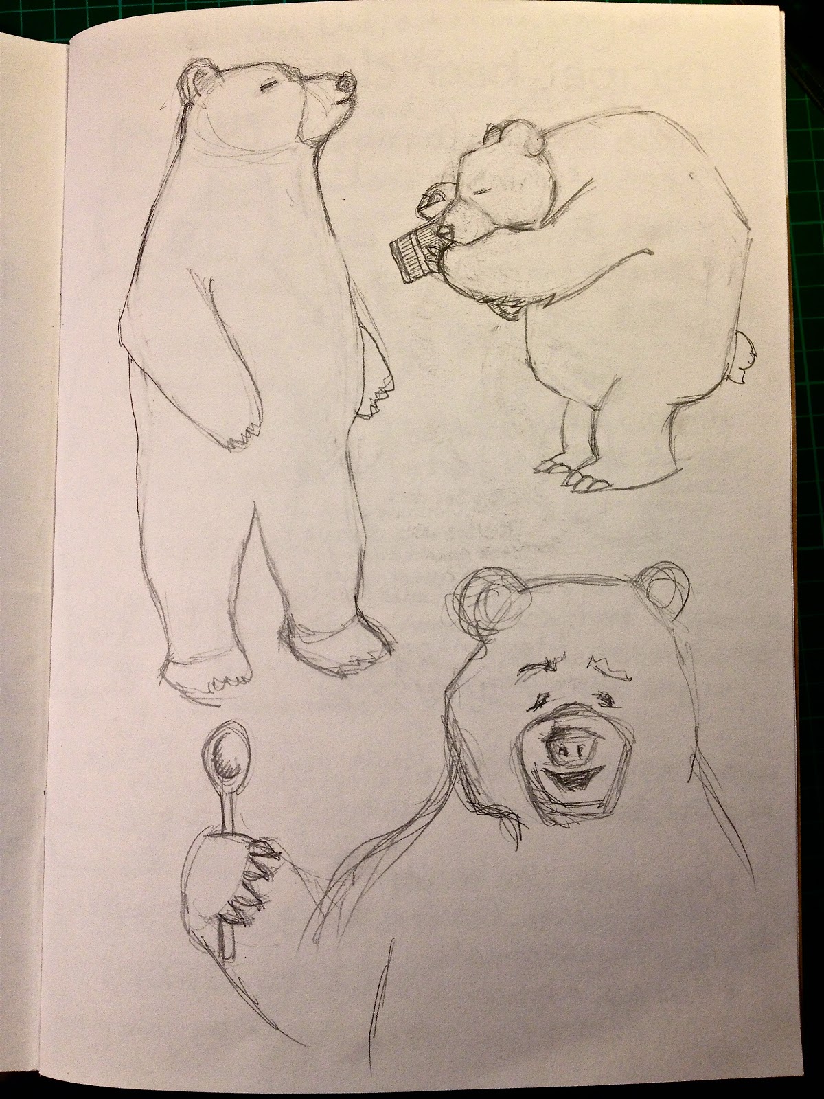 |
| Then I needed to have a go at ameliorating 'the bear' |
 |
| First efforts were very poor so I had another bash... |


Next I had to choose whether or not to use hand-drawn text or text that looks hand-drawn, I'd decided to try and tackle this digitally to see how it turned out so I had to have a look at some fonts:


Once I had all those ingredients I thought I'd have a crack at Photoshop'ing it all together - I can't use Photoshop, or rather I can't at this stage so I asked my friend and fellow student Sally Hewitt to help me and this was the results:

It's unfinished, mainly because it ended up being so far removed from what I'd wanted it to be and I was pretty down-hearted at the end of the day...
One very happy byproduct of the Photoshop day was that Sally taught me how to make an object look screenprinted - we took the hand drawn lemon from the project above and had a tinker, here are the results, I think as a starting point, they're pretty exciting (please remember Photoshop is new to me!)...
 |
| Plain lemon |
 |
| Textured lemon! |
.........................................................................
Making the Cover!
When I first started having ideas about this project I had this idea that the cover would look nice if I could somehow convey children looking into a 'box of fun' - I did a rough sketch and have since realised that it's not at all where I want to go, but in the interest of research I shall include it:

As I said... early days in the designing of the cover!
In the meantime, being more and more influenced by the Cricket magazines and artists like Friso Henstra, Milton Glaser and Peter Blake (to name a few) I thought I might have a go at papercutting the cover. I saw this first image and it was what finally pushed me into getting on with it:
 |
| Unfortunately I can't reference this amazing Magazine as I was on the run when I saw it and had to snap it with my phone! |
Then having received an incredible book in the post, illustrated by Friso Henstra, I was inspired to create a cover heavily influenced (in fact you'll see a lot of similarities between the following two images) by Henstra:
 |
| Friso Henstra, 'Forgetful Fred' |

Sadly the colours have come out very strangely and it's unfinished but I thought it was worth showing a work in progress...
...in the meantime here are a couple of other images I want to look at as the cover progresses:
 |
| Milton Glaser |
 |
| Milton Glaser |
 |
| Friso Henstra |
 |
| Luis de Horna |
I particularly like the way this illustration goes over the front and the back cover.
.........................................................................
Poetry:
I really want to include some poetry in my magazine, I loved reading Nonsense rhymes and poems that told fantastical tales. I've chosen a few to go in and one of them is Silly Old Baboon by Spike Milligan - which brought about a little experimental Baboon drawing:


No comments:
Post a Comment